Chicago Project Reveal
A few months ago an old clients reached out to ask if I would be open to designing her new home. Initially I was a bit hesitant because I was no longer interested in designing homes for clients! Long story short, working directly with clients wasn’t one of my goals, I was more focused on teaching folks how to design their homes themselves. As well as creating a lifestyle brand that was more than just design services. -That’s another topic for a later date…..
BEFORE
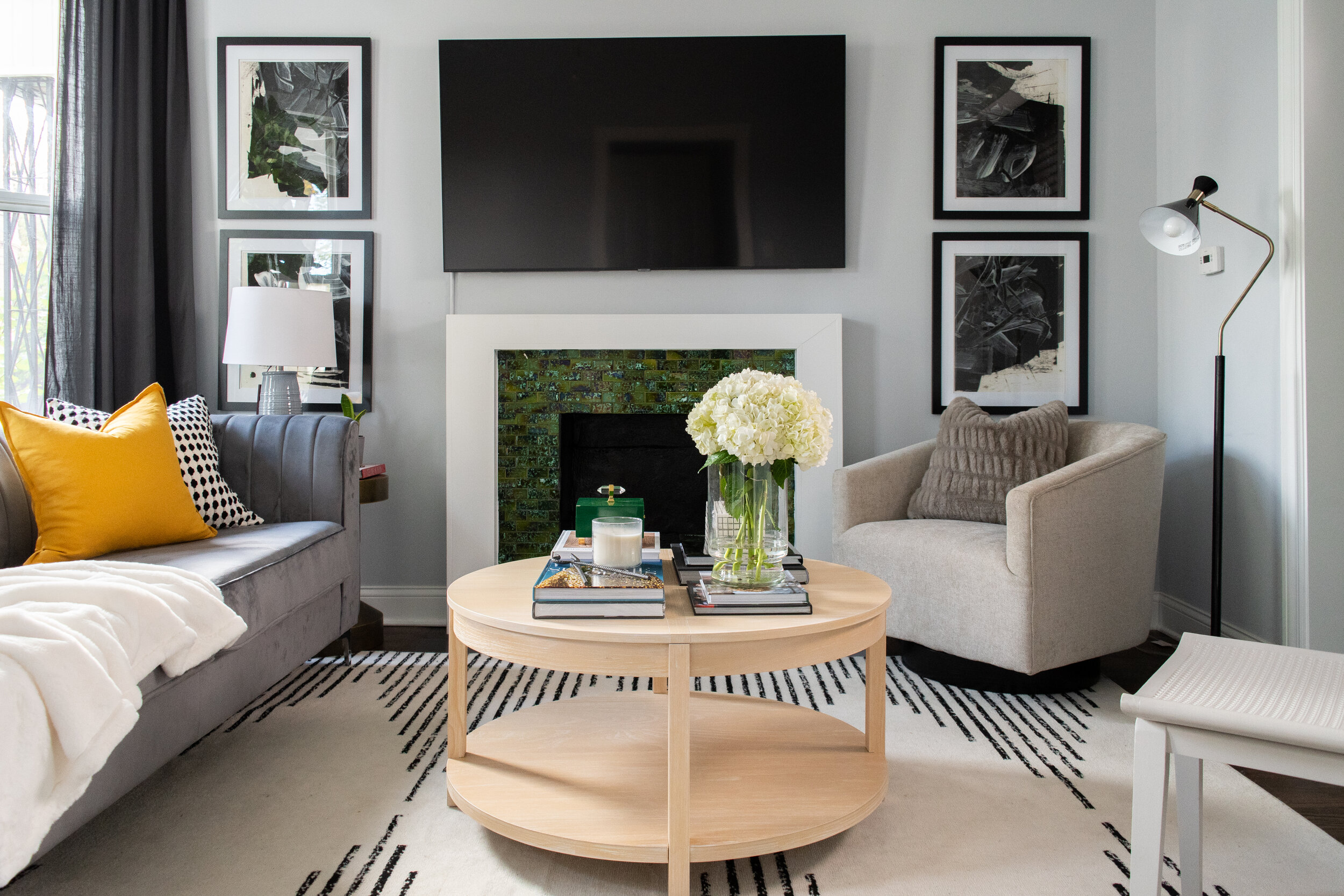
AFTER
Yes, the client wanted help with making her home beautiful, but her real issue was determining the best layout for her home lifestyle. When I performed the initial consultation I had the layout figured out almost instantly! My plan was to create a space that inspired community + conversation. With that in mind, I knew the fireplace + TV would not become the focal point.
I wanted to create a light and airy aesthetic layered with moody tones to give the space more depth and visual interest. My favorite way to create a light and airy space is by incorporating a light colored area rug and keeping the wall color light. That’s mainly because I knew that we were going to be doing this dark gray sofa + dark gray window treatment. -Never underestimate the power of adding contrasting elements into a space. That’s how you add interest.
Did you notice the dark frames mounted on the light colored walls? -That my friend is the perfect example of how to add contrasts to your space!
Disclaimer: I will not be sharing any sources or links to any of the items shown. I think it’ll be unfair for my client to pay for a room design and I turn around and share all of the sources with you for free. Please use these images as inspiration to fuel your personal style.


